Dear admin,
For years I have used Word to prepare my final copy before PDF' ing. Since I usually have to fully justify the text I am concerned that this looks its best.
Traditionally Word has a variety of justification schemes to choose from ranging in the case of Word 2007 from Word 2007 through Word 97, Word for MS DOS, Microsoft Word 6.0/95 etc etc. These invarably justify by increasing the inter-word spaces. This creates a loose looking text with rivers of white which is undesirable.
The one exception is the Word Perfect 6.X for Windows scheme (WP 6.X). In this method the inter-word spaces are allowed to decrease and the end result is a tighter and much better looking text. It seems that so many people prefer this justification method that Microsoft have maintained it to present and I believe that Word 2010 offers it as well.
Can you tell me what system Atlantis uses. It appears to use expansion to fill the lines. If this is the case, is there a technique to achieve WP 6.X type justification or could it be made an option?
I know about reducing the font size of inter-word spaces but that is a clunky solution.
thanks, Kaver.
Full Justification of text in Atlantis and Nova
Atlantis justifies texts by increasing inter-word spaces. No other justification scheme is currently offered in Atlantis. I am sorry, but it is unlikely that the "justify like WordPerfect" scheme will be offered in Atlantis in the nearest future. The scheme currently used in Atlantis is the default scheme in any version of MS Word. Atlantis also does not offer "compatibility options" like MS Word. Introducing only one compatibility option from a large set of options offered in MS Word, would not make much sense.
I afraid that the only way to achieve a "WordPerfect justification" in Atlantis is by applying a smaller font size to space characters. This can be easily done through the Find/Replace tool of Atlantis.
I afraid that the only way to achieve a "WordPerfect justification" in Atlantis is by applying a smaller font size to space characters. This can be easily done through the Find/Replace tool of Atlantis.
OK, thanks admin.
I can live with that.
However, related to this and following on I have another question.
Is it possible to "select all" text of a certain style in Atlantis/Nova?
This can be done with Word and it allows things like space characters to be changed only in those text masses that need it. Body text style is of course the one that would be the most important in the case of "full justification".
Changing space characters throughout the text in all styles will probably be OK nearly always but there may be times when it could introduce its own complications.
cheers, Erik
Hi Erik,
Here is what you can do.
1. Display the Styles Panel of the Atlantis Control Board.
2. Select the style whose text you want to select throughout the document.
3. At the bottom of this same Style panel, click “Select paragraphs associated with highlighted style” (rightmost button).
4. Press Ctrl+F, click in the “Find” box, then type in a space character, and press “Find And Select All”. Close the Find/Replace dialog.
5. Press Ctrl+D to open the Font Format dialog. Make any desired font formatting changes to the selected space characters.
HTH.
Cheers,
Robert
Hello,admin wrote:Atlantis justifies texts by increasing inter-word spaces. No other justification scheme is currently offered in Atlantis. I am sorry, but it is unlikely that the "justify like WordPerfect" scheme will be offered in Atlantis in the nearest future. The scheme currently used in Atlantis is the default scheme in any version of MS Word. Atlantis also does not offer "compatibility options" like MS Word. Introducing only one compatibility option from a large set of options offered in MS Word, would not make much sense.
I afraid that the only way to achieve a "WordPerfect justification" in Atlantis is by applying a smaller font size to space characters. This can be easily done through the Find/Replace tool of Atlantis.
registered user here...
was about to start a new thread when I read this. I have recently converted a manuscript from - rag right - to justify with hyphenation. When I visually look at some of the paragraphs it looks like some of the spacing is larger between some words then others. Are my eyes playing tricks on me?
How would I use find/replace to best adjust the spacing to not look "weird"? Just a space in the text to find and replace then "format" the space to a smaller font?
I see Font & Spacing tabs in the "Format" section.
thanks
Hi,
First, you must make sure that these oversized blanks are not due to the use of line breaks to create pseudo-paragraphs. Here is a picture illustrating how the space characters are treated in Justified alignment, depending on whether you create real paragraphs with the “Enter” key, or pseudo paragraphs with the “Shift+Enter” key combination:
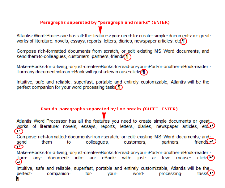
If this is the case in your document, it would be preferable to either change the paragraph alignment to “Left align”, or to replace all line breaks with paragraph end marks:
Find:
^l
Replace With:
^p
HTH.
Cheers,
Robert
First, you must make sure that these oversized blanks are not due to the use of line breaks to create pseudo-paragraphs. Here is a picture illustrating how the space characters are treated in Justified alignment, depending on whether you create real paragraphs with the “Enter” key, or pseudo paragraphs with the “Shift+Enter” key combination:
If this is the case in your document, it would be preferable to either change the paragraph alignment to “Left align”, or to replace all line breaks with paragraph end marks:
Find:
^l
Replace With:
^p
HTH.
Cheers,
Robert

OK. Nothing to do with line breaks then.
All the paragraphs on the above page start with a tab stop. This is a roundabout way to create first-line indents. But you’d be saving time and a lot of typing if you associated these paragraphs with a dedicated style, and gave a first-line indent value to the Paragraph Properties of that style. Atlantis would create the first-line indents automatically whenever you’d create any paragraph of that style. You would not have to press the tab key to introduce each new paragraph.
First, note that you’d have the same problem of big blanks with the same text in MS Word 2007, for example. But, let’s look at what’s happening in Atlantis. Below is an illustration showing the same text using different paragraph formatting values.
In the first paragraph, the first-line indent is artificially created by pressing the Tab key. The Tab Stop has its default value (3 picas on my system). As you can see, the interword spacing is big on the first 2 lines.
In the second paragraph, the first-line indent is also artificially created by pressing the Tab key. But, this time, the Tab Stop has a custom value of 2.36 picas. The interword spacing is OK.
The third paragraph has a first-line indent default value of 3 picas in its Paragraph Formatting Properties. The interword spacing is much too big here too.
The fourth paragraph has a first-line indent custom value of 2.36 picas in its Paragraph Formatting Properties. The interword spacing is OK.
So it seems you’d achieve better interword spacing if you applied a smaller (custom) value to indent your paragraphs. Here is what you could do:
1. Press “Ctrl+Home” to place the insertion cursor at the start of the document.
2. Press “Ctrl+F”.
3. Click the “More” button if available.
4. Check the “Use wildcards” box.
5. In the “Find What” box, enter “^p|^t|” (without the quote marks).
6. Press the “Find & Select All” button.
7. Leave the tab stops selected.
8. Click “Format | Tabs”.
9. In the “Tabs” dialog, press the “Add…” button.
10. Enter “2” (picas) as a custom tab stop. If you are not using picas, use any value that is less than the default value.
11. OK out of all open dialogs.
All the selected tab stops with have the same (custom) value, and hopefully, the justified lines with no longer display with big ugly blanks.
Finally, also note that these problems arise when there are definite page settings with definite page width. If your document is meant as a source document for eBook creation, it is utterly useless, and even counterproductive, to try to constrain page width. eReaders have screens of varying width. The big blanks that might appear on some screens might very well not appear on some others. With documents meant as source documents for eBook creation, it is best to work in Draft View mode (no page settings). The text reflow is done by the eReader depending on its own algorithms and available screen estate.
HTH.
Cheers,
Robert
- Attachments
-
- big_blanks.png (7.7 KiB) Viewed 16049 times

Thanks again. I applied the changes as you noted.
Applied the 2.36 picas / 0.333"
I need definite page settings as this is for a printed book 6x9, not ebook...though I suspect I'll make an ebook version shortly after.
So in the new screen capture above, the 'Gazing at Hayley' paragraph looks ok. But several others are now/still problematic.
Further down --
'Amanda's thoughts instinctively turned toward...'
'Amanda gently shook Hayley's shoulder'
Right page
'I think your father wants to talk to you'
Those are just a few examples of interword spacing that doesn't look good to my eye.
More suggestions? Would adjusting the Hyphenation help?
Hyphenation Zone - 0.1", Consecutive Limit - No limit
I have achieved reasonably good results with the following method:
1. Reduce the amount of first-line indenting as much as possible (desirable?)
2. Reduce the “Scale” value to “90%” in the “Format | Font” dialog (Spacing tab).
The results are illustrated in the first block of paragraphs below.
But the best results (second block of paragraphs below) were achieved by simply removing all first-line indenting and keeping the “Scale” value to 100%.
Do you really need to have first-line indents?
Note that the results also depend on which font face is used…
- Attachments
-
- big_blanks_2.png (14.98 KiB) Viewed 16035 times
Here is from Justified Type:
HTH.
Cheers,
Robert
From Typographical Tips from Microsoft Publisher:When type is justified, space is inserted between words and letters to expand a short line so that both margins align; conversely, in longer lines the space between words and characters is reduced to make them fit the margins. Some page layout applications have settings that will actually compress or expand the individual characters; don’t use these settings to justify text! This is the ultimate typographic taboo.
Too much additional space can create gaping holes between words, as well as rivers of white space flowing down your text. Too much compression makes type look cramped and squished, especially when compared to adjacent, generously spaced lines. All of this manipulation can severely degrade the color, texture and readability of your type.
With so many potential pitfalls, the wise designer will refrain from using justified type unless there’s a compelling reason to do so, and only when he or she has the time and flexibility to fine-tune the text.
Justified Type
Justification without fine-tuning can result in gaping holes, loosely spaced lines and rivers of white space, as seen in this excerpt from Charles Dickens’ A Tale of Two Cities, set in 15/18 Clarendon.
Justified Type
Most of the problems are corrected by reducing the type to 14 point and widening the column a fraction. However, these changes resulted in three hyphenations in a row towards the bottom of the paragraph, which is still undesirable.
Here are some tips for achieving smooth, readable justification:
– The more words that fit on a line, the fewer problems you’ll have. Achieve this by making the line length a bit longer, or by reducing the point size of your type, even if only by a fraction.
– If necessary, edit the text itself to fix lines that are too open or too tight. Try to reduce the number of lines with hyphenated endings, particularly if there are more than two in a row. It’s always possible to substitute short words for longer ones or trim convoluted sentences–your copywriter may welcome the chance to improve the writing, as well as the design!
– Become familiar with your software’s hyphenation and justification (H&J) settings. You can usually adjust the word and character spacing parameters, as well as hyphenation preferences.
Now I have achieved best results with the “Sitka Subheading” font (11pts) which is natively available in Windows 8.1. See illustration below.Don't justify text if the lines are short or the font is large; it can create unsightly gaps and slow down reading.
HTH.
Cheers,
Robert
- Attachments
-
- Sitka_Subheading.png (16.04 KiB) Viewed 16025 times
Thanks for the reply Robert. I'll play around with the manuscript using your suggestions. I can't not use indents, but maybe I could shrink them.
I am using Garamond - 12...I 'll see what it looks like with font size 11...but first I will finish my edits to the manuscript that I made in a proof copy of the book I have here - which has JL/rag right formatting...but so I've come to realize, full justification is the way to go.
I found just adding or changing words makes a difference...but this is more work of course and requires a line by line examination from a typography standpoint...which I was hoping to avoid...
When I'm all done I'll report back with what has worked!