I am just sharing a story that contains information that might be helpful to some of you at some time in the future.
I have a friend online whom I am helping with the formatting of his short ebook. Naturally it turns out that he has a blasted Mac instead of a Windows machine. I was hoping to get him to become an Atlantis user, but well ... what can you do?
Anyway, he wrote his ebook with Adobe Creative Suite, which produced a horrible swamp of tangled CSS codes. Then he used this font that I had never heard of, called Crimson. It is a lot like Garamond, but not as attractive as Garamond.
So he sends an epub to me, with the Crimson font embedded, and when I open the book in Sigil, I see that all of the body text is in italics. At first I thought that maybe he had done it that way deliberately, but I just could not believe that. So I asked him, and he was shocked to hear about the italics. He said that the book looked all right when he produced it. I should add that I am not sure that the text was true italics; I think it may have been just slanted to the right (an oblique style).
The code that Adobe CS produced was such a mess that I just did a copy-and-paste of one of the chapters over into a text editor, and then copied that text into Atlantis. I quickly developed some styles and had the chapter looking nice. I had even downloaded the Crimson font and had used it in the Atlantis document.
So I saved the chapter as an ebook, just to see how it would work. And ... the body text came out in italics.
I went through the CSS code that Atlantis had produced, and I found nothing wrong with it. I tried tweaking the code in various ways. Now, I have been working with HTML code for over twenty years and with CSS code for a number of years. I know my way around ebooks. I spent a lot of time working with this. I have also dabbled with font creation in the past, so I even imported the regular typeface of Crimson into a font-creation program to check it out. I checked all the settings and regenerated the font.
Still no luck. I still got slanted text if the font was embedded. The font looked fine when I was using Atlantis, and if I did a "Save but do not embed", the resulting ebook looked fine, because the font was not embedded; Sigil was reading the font from my computer system.
Then I experimented with some other fonts and found that some of them worked fine when embedded, and some showed up as slanted.
After some reading online, I have learned that this is just something that happens with some fonts. It has to do with the rendering engine of the ebook reader or readers like Sigil and Calibre. (Calibre showed the slanted fonts also, if they were embedded.)
This is a bit scary. Ebook readers are already quirky enough without this issue. It may be preferable to use generic "serif" and "sans-serif" codes instead of trying to embed those lovely fonts that can turn into a disaster.
I
Some people might want to know ...
Atlantis is a Windows application.
However, it seems that Windows applications can be run on a Mac through a dedicated utility called "WinOnX". You can find it at WinOnX 64.
Otherwise, to run Windows applications on Macs, you have more expensive (and probably more efficient) solutions, such as:
1. VMware Fusion 11
2. Parallels Desktop 14 for Mac
If your friend ever tries the adventure, we will be very interested to know the result. Thank you in advance.
Font embedding is a hit-or-miss game.
In any case, in most eReaders users can choose font type and font size. It is useless to try to force-feed readers exotic fonts they might not like.
Hi there
I don't think that this is a matter of MacOS. The reason is that I run a Wiindows-System (newest release) and there happened the same issue shortly!
I saved an ebook from AWP 3.2.10.3 with Trajan Pro as font for Heading 3, save and embed fonts ticked - and when I open it up in Sigil 0.9.10 it also shows Trajan Pro in italics - regardless that this font don't have italics...
So MacOS can't be that - in my eyes...
I downloaded “Trajan Pro Regular font” from dafontFREE.NET.
I applied that font to a Heading 3 style in a sample document.
I saved it as EPUB in Atlantis with font embedding.
That document displayed in both ADE and Calibre with the Heading 3 style in the Trajan Pro Regular font and non-italic characters.
There must be something special in your document that makes the Heading 3 style display in italics in Calibre.
HTH
Robert
The "slanted" font issue
It has been exactly one month since I posted my original (and only) post about this issue.
Since then I have done some reading on the internet. I still do not have an answer. Kovid Goyal (Calibre producer) had some things to say, but they struck me as speculative. He talked about eventually using a different ... uh, display engine (?), or something about Qt being involved.
A lot of people have encountered this phenomenon of the slanted font. And, to me, the font just looks slanted, not like a true italic.
I even encountered this with Cambria, which is a professional font that is not free. The sad thing there is that Cambria had become my standard serif font.
I finally decided to use Noto Serif, free and with no restrictions on using it in an ebook. It seems to work very well.
With an ebook you have no certainty that an ebook device will display it with the font that you have selected. You are fortunate if the device just handles the basic format properly.
Out of curiosity, I will download the Trajan Pro Regular font and see how it does in Sigil and Calibre.
Trajan Pro Regular
I checked out the font.
It did not come out slanted when I saved as an epub.
I checked two versions (the .otf version that Robert linked to; and a .ttf version from another site). Both versions worked the same way.
By the way, I could not tell for sure, but I had some suspicion that the font was pirated from Adobe. So I uninstalled the two versions after I tested them.
A few notes.
Embedding of fonts in an EPUB file might ensure that it is correctly displayed on current digital readers. However, there are some disadvantages to doing so:
- Embedding fonts in your EPUB files can significantly increase their size, up to several times their original size without the font files.
- Only some readers (such as Adobe Digital Editions) currently take into account the integration of fonts into EPUB files. If your eBooks are intended for noncompliant readers, it might be useless and ineffective to add fonts to them.
So it might be wise to embed fonts in EPUB files only if the original documents contain non-Latin or very special characters that may not be displayed correctly on the digital readers for which the corresponding EPUB files are intended.
Be careful! Most fonts available as original fonts on a Windows system are subject to licensing agreements. They are not royalty-free and cannot be redistributed, even if it is within an EPUB file. Embedding of such fonts in your EPUB files is unlawful. To avoid this problem, only embed fonts that are free of rights and whose redistribution is allowed. You will find fonts free of any rights on the GoogleFonts site. These fonts can be installed using the SkyFonts utility.
Other fonts free of rights are available at the following web addresses:
- Gentium
- Droid Serif
- LinuxLibertine
The slanted font, etc.
Yeah, the copyright holders of the fonts saw an opportunity to be greedy and took advantage of it.
I would not use any of those commercial fonts for embedding in ebooks that will be distributed.
Fortunately we have some pretty good truly free fonts ("free" as in "you can use them however you want"). Noto is one of the best that I have found. It is very nice.
As for the greater issue of font embedding, I like to embed fonts, because some devices do respect the CSS code for the fonts. Also, devices will undoubtedly improve.
Yes, embedding fonts can enormously increase the size of an epub file (and I am not even considering the Kindle and its incomprehensible format varieties). You do not want to have an unnecessarily bloated book because you have used lots of embedded fonts.
However, you can exercise some prudence about overuse of fonts, and you can subset the fonts that you embed. I always take my Atlantis-generated epub file and use the free program Calibre to subset the embedded fonts. Doing that greatly reduces the file size. I have not run into any technical problems by doing this.
If file size is an issue (and it can be, because of limitations that ebook distributors impose), you can choose not to embed any fonts, and you can instead tweak your CSS code to ask a device to use a particular font if it is available on the device. It is very simple to do if you know how ... but most people do not want to get involved in all of that, I know.
You do not know for sure how an ebook will look, because the reading devices just do not all work the same way. Keeping things simple works better. But even so, I am impressed by how nice ebooks look on some modern devices.
I agree with Robert that you should check out Google fonts. You have a big selection there.
Just for showing...
I have shortened one of the books I spoke about to only the Prologue and will attach it in *.epub and *.rtf format to make the issue clear.
And Robert - it's not a big thing to me - for the moment at least - cause I save it then with 'save, but don't embed'setting
Indeed it may become in future cause sometimes I edit books with very special fonts like 'Kaiserzeit Gotisch' or similar fonts and then I have no other choice than to embed...
regards
- Attachments
-
- Hoffman - Stravaganza 3 - Stadt der Blumen Example.epub
- book file
- (1.66 MiB) Downloaded 657 times
-
- Hoffman - Stravaganza 3 - Stadt der Blumen Exanple.rtf
- source file
- (318.56 KiB) Downloaded 619 times
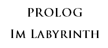
Heading 3 paragraph in RTF file in Atlantis:
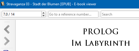
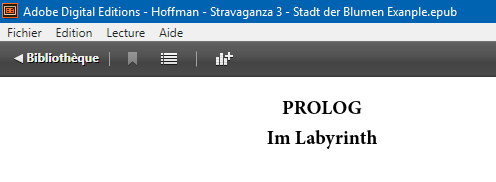
The following screen captures were made after embedding the Trajan Pro font in the EPUB file generated by Atlantis.
Heading 3 paragraph in EPUB file in Calibre:
Heading 3 paragraph in EPUB file in Adobe Digital Editions:
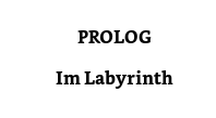
Heading 3 paragraph in MOBI file in Kindle Previewer 3:
The following screen captures were made after embedding the Trajan Pro font in the EPUB file generated by Atlantis.
Heading 3 paragraph in EPUB file in Calibre:
Heading 3 paragraph in EPUB file in Adobe Digital Editions:
Heading 3 paragraph in MOBI file in Kindle Previewer 3:
There is obviously a problem with Sigil. Please take a look at How to embed fonts into your ebook with Sigil
The slanted font, again
I downloaded the epub that Kiruhdu provided. I do not have Trajan Pro installed.
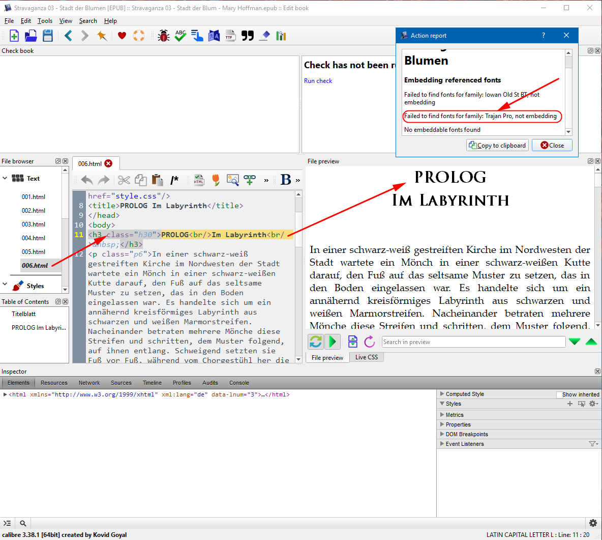
The heading in question is slanted in Sigil and Calibre.
Sigil has Trajan Pro listed in the Fonts folder.
Calibre (most recent version, 3.38.1, 64-bit) has Trajan Pro listed in the Fonts folder, and under Manage Fonts it says that Trajan Pro is embedded:
The Action Report of Calibre says that the font Iowan Old Style is not found (and it is not listed in the Fonts folder of Sigil or Calibre). It does not say that Trajan Pro is not found.
Edit to previous post
Edit to add:
I ran the Subset Font option in Calibre.
It found the Trajan Pro font and subsetted it.
DIFFERENT ISSUE ENTIRELY ...
I used to post graphics here, but I have forgotten the technique. Is it necessary to upload a graphic to an internet site before I can link to it and make it appear here? I tried linking to my graphic on my computer by providing a complete path, but that did not work.
Have a look at Using Atlantis Forum: Attaching images and files.